Identity projects are some of my favorite work
The opportunity to define how an organization is perceived and recognized across all media, from the sign out front to giveaways at tradeshows, is a wonderful way to really get to know a business, its customers and how to best serve and create value for everyone.

Show Me State Games
This mark served as an identity for various SMSG (State Olympic) events from 2007 on.

Plane.edu.au
Plane was an online continuing education platform that was playful without being geeky.
The District
An original version of this mark served the CID well for a decade, The District’s leadership was interested in a refresh that would “go unnoticed by a casual observer.”
Vision Zero
Columbia’s Vision Zero goal needed a recognizable mark that could be broken into smaller components for video and promotional use.

Nursing Beyond Borders
The (proposed) logo for this tremendously agile medical NGO logo is corporate without looking stuffy.
La Roca Dance Studio
Located on the beautiful Lake of the Ozarks, La Roca Dance Studio caters to those wanting to learn the art of Ballroom, Latin and Swing dancing
Academy
More than a daycare — This structured curriculum develops life skills and prepares children for kindergarten and beyond.

Blue Frog Cafe
This illustrated logo was inspired by the unique bright blends and character of this coffee shop.

PedNet
This fabulous non-profit that advocates for active transportation needed a logo, branding, web, print and a lot of collateral products along the way.

CoMo Realty
This mark reflected how looking at homes had changed so much in the early 2000s and how this realtor was keeping up with the times.
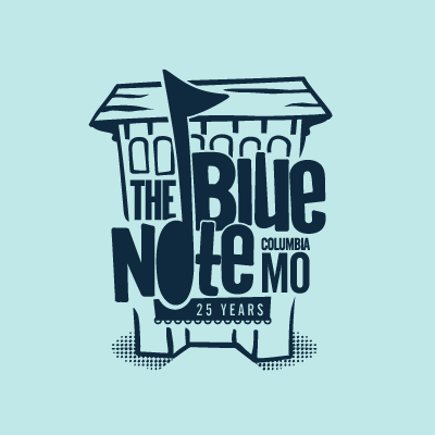
The Blue Note
Mimicking a rough woodblock cut, this mark represented one of Columbia, Missouri’s best known identities.
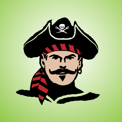
Arnie Realty Group (ARG!)
Arnie, a local real estate developer, asked for a pirate. A handsome pirate.